A reader recently commented that he
didn't understand why there are so many layer modes in GIMP and he
wondered just what one is supposed to do with all of them. Since I
wasn't able to help right off the bat, I decided to do some research
and experiment. Figuring stuff out for yourself is fun and I find
that it burns in the knowledge. So what follows is the process I went
through to try and understand more about layer modes.
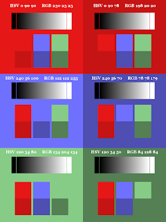
First, I created a 900 x 1200 canvas in
GIMP divided into six sections: light red, dark red, light blue, dark
blue, light green, dark green. I varied the intensities of the colors
a bit to make it easier to notice possible differences. The HSV and RGB numbers in each large block indicate the actual color values. On top of
each color I put a grayscale gradient with a block of black on the
left and a block of white on the right. I merged all of the small
color blocks onto a transparent layer to make a test pattern layer
above the six-color background. I thought this example would be
useful for artists to see how layer modes affect colors.
 |
| Color Patterns on Color Blocks |
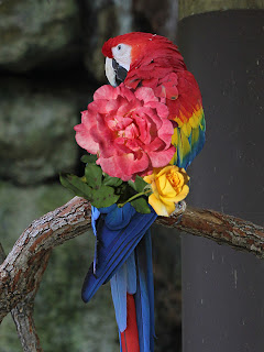
Next, I created a 900 x 1200 canvas
with a photo of a scarlet macaw on the lower layer and a photo of
some roses that I cut out and put on a transparent background on the
upper layer. I thought this example would be useful for photographers
to see how layer modes affect images.
 |
| Roses on Macaw |
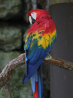
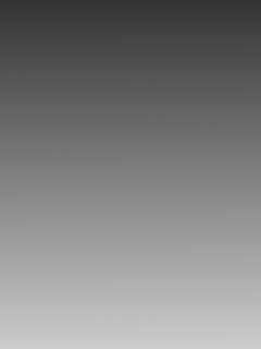
Then I created a copy of the scarlet
macaw photo with a grayscale gradient layer above it running from HSV
0, 0, 20 at the top to HSV 0, 0, 80 at the bottom to show the effects
of layer modes on grayscales over color images. I also created a
duplicate layer of the scarlet macaw to show the effects of layer
modes on images over themselves.
For each of the test images, I changed
the layer mode of the upper layer to each mode and saved the result. Since pictures are worth more than any number of words, especially (I'm sure) to the types of people who use GIMP, I've included images in each section below as references. What follows are my observations and thoughts about how to use each layer mode. Feel free to copy any of these images to your desktop so you can load them into GIMP for a closer look.
The layer modes are presented in the
order in which they appear in the Mode drop-down menu. Here's a full list with quick links.
| Normal | Multiply | Grain Extract |
| Dissolve | Burn | Grain Merge |
| Lighten Only | Overlay | Divide |
| Screen | Soft Light | Hue |
| Dodge | Hard Light | Saturation |
| Addition | Difference | Color |
| Darken Only | Subtract | Value |
Normal is the default layer
mode. It simply shows the topmost visible layer in the Layers list.
If there is any transparency on that layer, you will also see
anything below it through the transparent areas. You can blend the
topmost visible layer with what's below it by adjusting the layer's
opacity.
The purpose of the Dissolve
layer mode is to dissolve the upper image into the lower one by
creating variable-sized and random-looking holes in the upper image.
The frequency of the occurrence of these holes is based on the upper
layer's opacity (which can be thought of roughly as the percentage of
dissolving), each upper pixel's original opacity, and the effect of
the layer's mask on each pixel.
If the layer on which Dissolve
is applied has no transparent or semi-transparent pixels, you won't
see a change in the image until you move the layer's opacity off of
100%. This was true of my two test images.
Saul Goode at Gimp Chat provided the
following example which illustrates Dissolve well. The bottom layer is pure white. The top layer is a gradient of red that goes from opaque at the top to transparent at the bottom. The mask on the red layer is a gradient that goes from opaque at the left to transparent at the right. Examine the images to see the differences among Normal mode, Dissolve mode at 100% opacity, and Dissolve mode at 50% opacity.
|
|
||||
|
|
Thoughts:
I find the effects of Dissolve
to be rather jarring because of the sharp transitions between the
upper and lower images. Though there may be interesting artistic uses
of this method, you might want to further process the image to reduce
the sharpness and blend the images better.
However, it occurs to me that the
Dissolve layer mode could be used to create an interesting texture effect of one color over another. Since there is no anti-aliasing or feathering of the holes, you could create the density of stippling you like, then create a new layer from what's visible, select the color of the holes, use Select > Featherwith a small number, then either hit Delete and put a colored layer under it or pour a color into the selection.
Example:
To test my texture effect idea, I
created a 900 x 1200 canvas with a blue layer over a green layer. I changed the layer mode of the blue layer to Dissolve and set the opacity to 55%. The image on the left is a 50 x 50 cutout scaled up to 1000 x 1000 to show the grain.
Then I created a new layer from
visible, used the Select by Color tool to select all green pixels, used Select > Feather with a setting of 3 px, then filled the selection with yellow. The image on the right is a 50 x 50 cutout scaled up to 1000 x 1000 to show the grain.
After comparing the HSV and RGB values
of the original colors and the final results of using Lighten
only, I found that the color of each result is determined by
taking the largest value of each of red, green, and blue from the
initial colors. For
example, if an RGB of 134, 204, 134 is combined with an RGB of 78,
78, 179, the result is RGB 134, 204, 179. Since pure black is 0, 0, 0
and pure white is 255, 255, 255, taking the highest numbers makes the
resulting color lighter.
Observations:
- It does not matter which layer is on top.
- Black has no effect on the final result.
- White results in white.
- A color lightened against itself has no effect on the final result.
- Shades of gray serve to lighten the other color. Darker shades of gray lighten less. Lighter shades of gray lighten more.
- If one layer is grayscale and the other is color, the effect of Lighten only is to desaturate the color layer. That is, if you look at the HSV numbers, only the saturation changes.
- When two non-grayscale colors are involved, the result is a lighter version of a combination of the two. Since there is no attempt to maintain the hues of the two initial colors, the resulting hue can be quite different from either.
- The lightening power of Lighten only is not as intense as either Screen, Addition, or Dodge.
Thoughts:
- Use Lighten only with a grayscale layer and a color layer for lightening (desaturating) the color layer without affecting the hue or value (in general), keeping in mind that if a gray pixel has larger red, green, and/or blue values than the corresponding color pixel, then the resulting pixel will tend toward being gray.
In examining the changes in RGB values
when using Screen mode, I noticed that each resulting color had higher red, green, and blue values than either of its initial colors, thereby making the final image lighter. However, the formula involved in computing the result was entirely non-obvious, so I was forced to resort to the user's manual.
Here's the equation in English:
Invert color 1.
Invert color 2.
Multiply the results.
Divide that result by 255.
Invert that result.
Multiply the results.
Divide that result by 255.
Invert that result.
Observations:
- It does not matter which layer is on top.
- Black has no effect on the final result.
- White results in white.
- Shades of gray serve to lighten the other color. Darker shades of gray lighten less. Lighter shades of gray lighten more.
- If one layer is grayscale and the other is color, the effect of Screen is to lighten the color layer without affecting the hue. That is, if you look at the HSV numbers, hue does not change.
- When two non-grayscale colors are involved, the result is a lighter version of a combination of the two. This means the resulting hue can be quite different than either of the initial hues.
- The lightening power of Screen is more intense than Lighten only, but not as intense as either Addition or Dodge.
Thoughts:
- Use Screen with a grayscale layer and a color layer to lighten the color layer without affecting the hue.
- Use Screen on the upper layer of a duplicated image and vary the opacity to adjust brightening of the lower image without affecting the hue.
Dodging is a photographic printing
technique that decreases the exposure for areas of the print that the photographer wishes to be lighter. In examining my result images, I noticed that Dodge increases the values of red, green, and blue above both of the initial values. According to the user's manual, the value of each pixel on the lower layer is multiplied by 256. The result is then divided by 256 minus the value of the corresponding pixel on the upper layer.
|
|
||||
|
Observations:
- Because of the way the equation works, it is important which layer is on top.
- Black on the upper layer has no effect on the final result.
- Black on the lower layer results in black.
- White on either layer results in white.
- If the upper layer is grayscale and the lower layer is color, the effect of Dodge is to lighten the color layer without affecting the hue until it gets to white. That is, if you look at the HSV numbers, hue does not change until it pegs at white.
- Color on both layers can result in either a lightening or a hue change, or both.
- The lightening power of Dodge is more intense than Lighten only, Screen, or Addition.
Thoughts:
- Use Dodge with a grayscale upper layer and a color lower layer to lighten the color layer without affecting the hue (in general).
- Use Dodge on the upper layer of a duplicated image and vary the opacity to adjust brightening of the lower image without affecting the hue (in general).
See the following articles for examples of using Dodge mode.
- GIMP Quickie No. 3 – Creating a Pencil Sketch from a Photo
- Getting Around in GIMP - Blue Channel Check Layer (Retouching) by Pat David
The Addition layer mode does
what its name implies. The red, green, and blue values of the two layers are added together, pegging at white. This results in an overall lightening of the combined image.
Observations:
- It does not matter which layer is on top.
- Black has no effect on the final result.
- White results in white.
- If one layer is grayscale and the other is color, the effect of Addition is to lighten the color layer without affecting the hue until it gets to white. That is, if you look at the HSV numbers, hue does not change until it pegs at white.
- Color on both layers results in a lightening, plus a possible change in hue.
- The lightening power of Addition is more intense than Lighten only or Screen, but less intense than Dodge.
Thoughts:
- Use Addition with a grayscale layer and a color layer to lighten the color layer without affecting the hue (in general).
- Use Addition on the upper layer of a duplicated image and vary the opacity to adjust brightening of the lower image without affecting the hue (in general).
If you have specific uses not mentioned here for any of these layer modes, please leave a comment. I'd love to hear about it.
For another review of layer modes in GIMP along with interesting visuals, see the four-part series at emptyeasel.com.
For information on blend modes in general, independent of the software that implements them, see Wikipedia: Blend modes.
See also:
GIMP's Layer Modes (Somewhat) Demystified – Part 2: Darken Only to Subtract
GIMP's Layer Modes (Somewhat) Demystified – Part 3: Grain Extract to Value
GIMP's Layer Modes (Somewhat) Demystified – Part 4: A Pictorial Comparison


thank you
ReplyDeleteYou are very welcome.
ReplyDeleteDebi, this is excellent, just astonishingly good! It's the Rosetta Stone--the real one, not the software--of layer modes.
ReplyDeleteThanks, B! I try to inform (accurately, even, if possible). :)
ReplyDeletethose 4 parts are so usefull!
ReplyDeletethank you very much for this work :)
NathL from France
You're very welcome. I'm glad you find the information helpful.
ReplyDelete