Contents ~ Posts ~ Free Images ~ GIMP 2.8 Shortcuts ~ Studio Dalio Gallery

23 April 2014

Four Ways to Draw a Border Around a Selection in GIMP

I was recently asked for a quick way to draw a border three pixels wide around the inside edge of a rectangular selection on top of an in-progress graphic design. Two methods immediately came to mind and a third occurred to me later that afternoon. I discovered a fourth method while writing this article.


Method 1


The most obvious method to use is Select > Border [1], which opens the Border Selection dialog [2]. This dialog contains three adjustments.

Border Selection Dialog

04 March 2014

Alignment and Distribution of Graphic Elements in Inkscape

Inkscape's alignment and distribution functionality is wonderful to use for organizing graphic or typographic design elements or laying out printed matter. In this tutorial I will demonstrate this by creating a simple graphic design of colored stars.


Multi-colored Stars Graphic
The Stars are in Alignment

04 February 2014

Alignment and Distribution of Graphic Elements in GIMP

When creating graphic or typographic designs or laying out printed matter such as brochures, leaflets, or newsletters, knowing how to use GIMP to organize and move graphic elements can be very handy. In this article I will explore GIMP's alignment and distribution functions by creating a simple graphic design of colored circles.


Final Dot Graphic

24 December 2013

GIMP's Layer Modes (Somewhat) Demystified – Part 4: A Pictorial Comparison

For a final comparison among the layer modes, I created several examples that visually show the effects of combining various layers.

Grayscale on Grayscale


First, I created a square non-dithered grayscale linear gradient lower layer, then made a copy and rotated it 90º for the upper layer. I chose each layer mode to see the effect. Here's a visual representation of what occurs with each layer mode.

17 December 2013

GIMP's Layer Modes (Somewhat) Demystified – Part 3: Grain Extract to Value


In this article I discuss the following layer modes: Grain Extract, Grain Merge, Divide, Hue, Saturation, Color, and Value. I will use the same test images I used for Part 1 and Part 2.


Color Patterns on Color Blocks
Roses on Macaw
Roses on Macaw
Macaw
Macaw
Grayscale Gradient
Grayscale Gradient


For each of the test images, I changed the layer mode of the upper layer to each mode and saved the result. I've included these images in each section below as references. What follows are my observations and thoughts about how to use each layer mode. Feel free to copy any of these images to your desktop so you can load them into GIMP for a closer look.

The layer modes are presented in the order in which they appear in the Mode drop-down menu. Here's a full list with quick links.

Normal Multiply Grain Extract
Dissolve Burn Grain Merge
Lighten Only      Overlay Divide
Screen Soft Light Hue
Dodge Hard Light Saturation
Addition Difference Color
Darken Only Subtract Value


04 December 2013

GIMP's Layer Modes (Somewhat) Demystified – Part 2: Darken Only to Subtract


In this article I discuss the following layer modes: Darken only, Multiply, Burn, Overlay, Soft light, Hard light, Difference, and Subtract. I will use the same test images I used for Part 1.


Color Patterns on Color Blocks
Roses on Macaw
Roses on Macaw
Macaw
Macaw
Grayscale Gradient
Grayscale Gradient

For each of the test images, I changed the layer mode of the upper layer to each mode and saved the result. I've included these images in each section below as references. What follows are my observations and thoughts about how to use each layer mode. Feel free to copy any of these images to your desktop so you can load them into GIMP for a closer look.

The layer modes are presented in the order in which they appear in the Mode drop-down menu. Here's a full list with quick links.

Normal Multiply Grain Extract
Dissolve Burn Grain Merge
Lighten Only      Overlay Divide
Screen Soft Light Hue
Dodge Hard Light Saturation
Addition Difference Color
Darken Only Subtract Value


20 November 2013

GIMP's Layer Modes (Somewhat) Demystified – Part 1: Normal to Addition


A reader recently commented that he didn't understand why there are so many layer modes in GIMP and he wondered just what one is supposed to do with all of them. Since I wasn't able to help right off the bat, I decided to do some research and experiment. Figuring stuff out for yourself is fun and I find that it burns in the knowledge. So what follows is the process I went through to try and understand more about layer modes.

First, I created a 900 x 1200 canvas in GIMP divided into six sections: light red, dark red, light blue, dark blue, light green, dark green. I varied the intensities of the colors a bit to make it easier to notice possible differences. The HSV and RGB numbers in each large block indicate the actual color values. On top of each color I put a grayscale gradient with a block of black on the left and a block of white on the right. I merged all of the small color blocks onto a transparent layer to make a test pattern layer above the six-color background. I thought this example would be useful for artists to see how layer modes affect colors.
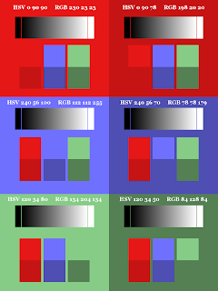

Color Patterns on Color Blocks